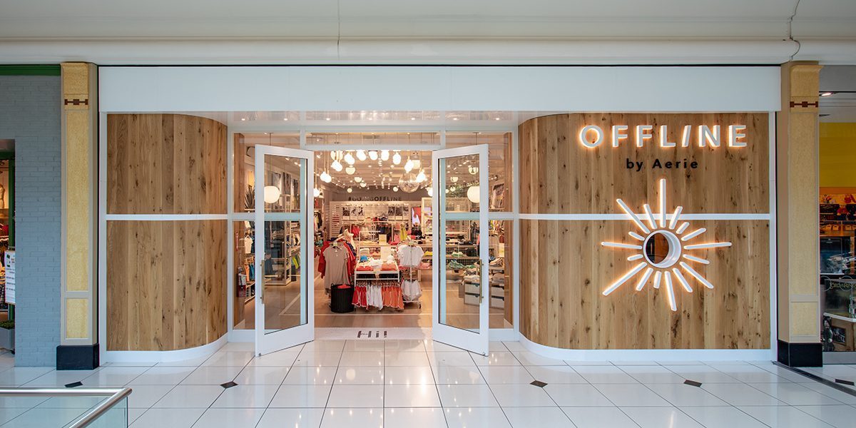
In the age of social media, the mantra for brick-and-mortar retail often seems to be: If it’s not Instagrammable, it won’t sell. Store owners, especially in the boutique, lifestyle, and specialty sectors, are investing heavily in visually stunning interiors—moody lighting, velvet seating, complex display systems, and striking architectural features.
While creating a beautiful space is essential for brand identity and attracting foot traffic, a critical and costly mistake often surfaces: prioritizing aesthetics to the detriment of core business functionality. This “Insta-Trap” turns a beautiful retail space into an inefficient, frustrating, and ultimately unprofitable operation. Your store might look like a magazine spread, but if customers and staff can’t move, see, or shop effectively, the beautiful design becomes a liability.

1. The Operational Nightmare: Clutter and Flow Blockages
A store must be designed for selling and restocking first, and for photos second. When functionality is ignored, the daily running of the shop collapses.
The Customer Journey is Broken
The customer journey—the path a shopper takes from the entrance to the checkout—must be intuitive. An aesthetic-first approach often breaks this flow by:
- Narrow, Stylized Aisles: Trendy, compact shelving or unique display fixtures may look modern, but if they reduce aisle width below a comfortable walking standard (especially for two people or one with a stroller), shoppers feel confined and rush through the store.
- Hidden Checkout Areas: Some designs try to blend the till point into the decor, making it difficult for customers to find where to pay. The checkout process must be clear, fast, and highly visible to prevent the number one cause of abandoned purchases: long, confusing queues.
- Blind Spots for Staff: Overly complicated room dividers or floor-to-ceiling visual displays, while attractive, can create blind spots that hinder staff from monitoring the floor, leading to missed sales opportunities and increased risk of shrinkage.
The Back-of-House Burden
Functionality extends past the velvet ropes. If the glamorous front-of-house design neglects easy access to stockrooms, efficient changing rooms, or practical restocking paths, the staff workflow suffers. Slow replenishment, difficult inventory management, and increased labour costs for moving stock around elaborate fixtures will erode profit margins, regardless of how many likes your store gets online.
2. Product Presentation vs. Accessibility
The goal of retail design is to sell products, not just admire the fixtures. When products become mere props for the aesthetic, sales drop.
Low Visibility for Sales
Boutique stores often favor “less is more” displays, using minimalist shelving or unique, artistic props. The mistake is when these displays make it difficult for customers to physically access and interact with the merchandise. If a customer has to be afraid of breaking a complex, delicate display just to pick up a product, they won’t buy it. A beautiful, abstract shelving unit that holds only three items is a massive waste of high-value retail space.
Lighting That Looks Good, But Doesn’t Sell
Lighting is an emotional tool, but it also needs to be a selling tool.
- Overly Moody Lighting: Low, atmospheric light is great for bars, but in retail, it can make it impossible for customers to accurately judge the color or texture of clothing, makeup, or furniture. Customers won’t buy what they can’t clearly see.
- Art Lighting vs. Product Lighting: Many owners splurge on decorative light fixtures that illuminate the ceiling or the floor, but neglect task lighting that specifically highlights the product on the shelves or mannequins. Lighting must draw the customer’s eye to the merchandise, not the light fixture itself.
3. The Sensory Overload and Brand Disconnect
A cohesive, functional design is an extension of the brand’s promise. Aesthetic chaos creates a sensory experience that pushes customers away.
Design Inconsistency
A common error is chasing too many simultaneous design trends—industrial brick walls mixed with rococo furniture and ultra-modern neon signs. This sensory overload confuses the customer about the brand’s identity and creates a chaotic feeling that discourages lingering. A successful design is coherent, choosing a visual language and sticking to it across all fixtures, materials, and signage.
Form Over Comfort
Choosing beautiful, unique seating or checkout benches that are fundamentally uncomfortable or impractical is a betrayal of the customer. A gorgeous but painful chair encourages a faster exit. Retail design must strike the balance: the materials should be durable to withstand high traffic and comfortable to encourage longer stays, especially in fitting room waiting areas or lounge sections.
Conclusion: Function is the New Aesthetic
The most successful offline shops in the modern era understand that great functionality is beautiful design. The sleek, clutter-free look of a well-designed space is a result of meticulous planning that optimizes every square inch for a seamless customer experience and maximum staff efficiency.
To thrive, retailers must start with the operational blueprint: map the customer journey, prioritize easy access to products, ensure speed at the till, and then layer the aesthetic elements—the colors, textures, and decorative fixtures—on top. Only by integrating form and function can a business leverage the visual appeal needed for social media buzz while sustaining the operational excellence required for long-term profit. Don’t let the pursuit of a perfect photo obscure the goal of a perfect sale.